Helsinki Expo and Convention Centre — Pulp & Beyond
An industry’s transformation at the heart of a brand
- Brand renewal
- Graphic design
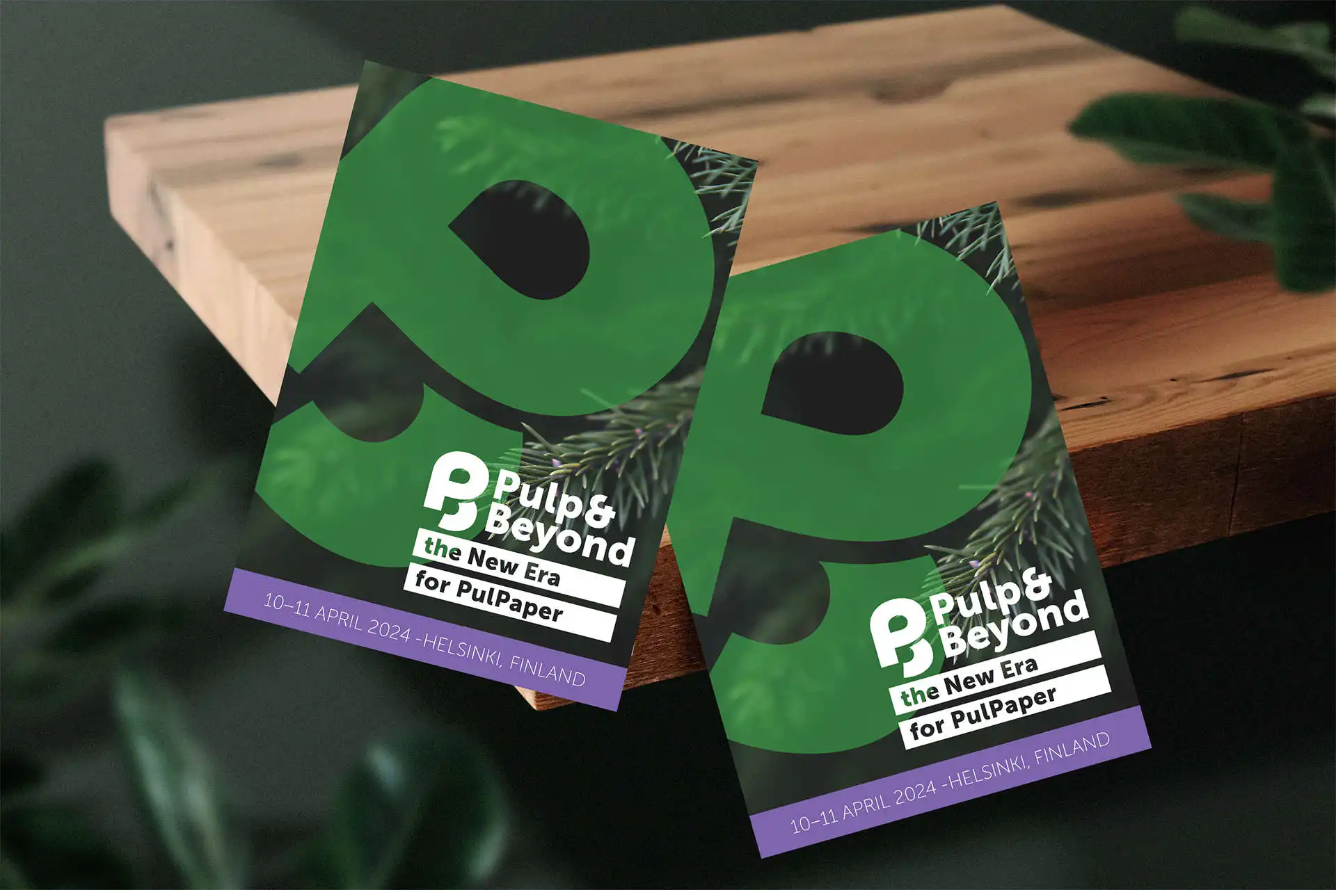
Traditionally, cellulose brings paper and the paper industry to mind. Today, however, the story is much bigger: forest-based bioeconomy innovations are building a sustainable future.
Pulp & Beyond is an internationally recognised industry event organised by Helsinki Expo and Convention Centre and the Finnish Forest Products Engineers’ Association, previously known as PulPaper. The organisers wanted to renew the visual identity and clarify and refresh the event concept, as the emphasis on PAPER felt outdated.
This was more than a visual update: it was a major change in a conservative environment. The goal was to establish a shared market vision to guide all event marketing and brand building.
Looking ahead towards a solution
We began with workshops, involving industry representatives and customers alongside the development group. The conclusion was clear: the event’s new brand needed to reflect the transformation of the entire industry. It is about innovations, products, services, technologies and people, rather than paper alone.
This became the concept: Pulp & Beyond.
- Pulp & Beyond is breaking event industry myths this week, and I take my hat off to the nearly 200 leading companies that have accepted the challenge. International visitors are highly active, there are significantly more students and the conference is almost full: plenty of positive signs, says the association’s CEO Antti Lindqvist.
What do we sound like?
We defined the event’s vision, tone of voice and core messages for versatile use in marketing.
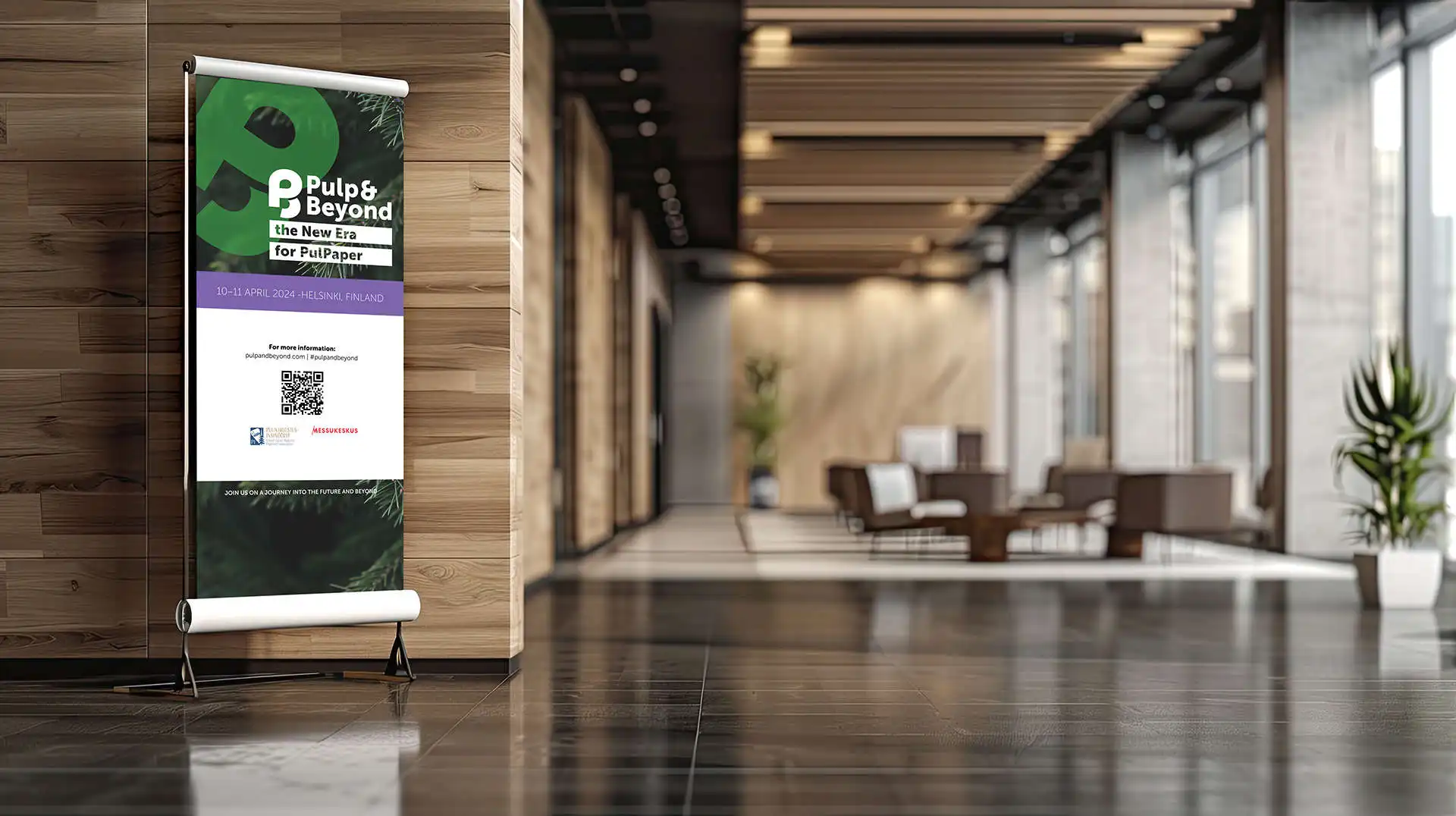
Pulp & Beyond is a pioneering, leading international forum bringing together forest-based bioeconomy innovations, products, services, technologies and people. It creates the setting for excellent conversations and encounters.
Its tone of voice is experienced, warm and forward-looking, conveying confidence and a sense of community. The new voice aimed to establish ownership of the industry’s most compelling event.
What do we look like?
We wanted a contemporary, forward-looking identity. The logo combines the typography of the letters P and B. It uses two colours and is easily recognisable.
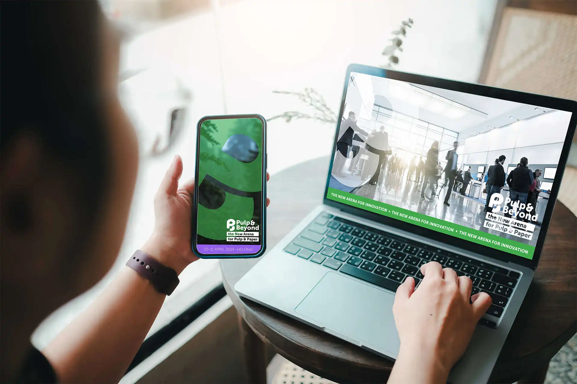
The imagery highlights forests, encounters, innovations, technologies and solutions.
From event to phenomenon
As part of the brand renewal, we also updated the event concept. We wanted to create new ways for people to meet and lead the way in responsibility. For example, exhibition stands are made entirely from sustainable, recyclable materials.
The Pulp & Beyond trade fair took place at Helsinki Expo and Convention Centre on 9–12 April 2024. International companies from 19 countries took part.